Santeon
strategy
expression
Nov 2025
Story: Santeon
Imagine this: seven leading hospitals deciding to leave their own paths behind to build a new future together. That is Santeon. Back in 2007, they already felt the same drive: healthcare in the Netherlands can be better, and it has to be better. Not driven by a top-down mandate, but by a deeply felt inner urgency. The challenge was to give that collective ambition a name, a heart, and a face that could connect everyone.
Santeon
Seven leading hospitals deciding to leave their own paths behind to build a new future together. Not because the Ministry told them to. Because they felt it: healthcare in the Netherlands can be better, and it has to be better. Since 2007, Santeon has been joining forces to improve healthcare in a tangible way: learning together, standardising where it can, personalising where it must, and getting innovation off the ground faster.
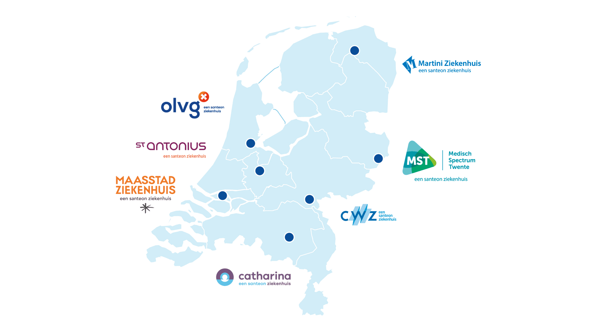
The ambition was obvious. The identity work was the harder bit: how do you give seven strong hospital brands one recognisable national voice without quietly erasing any of them?
Listening to the people who carry healthcare
Our collaboration with Santeon spans more than a decade of trust, which means we've had the luxury of doing this properly rather than in a single sprint. From day one we worked with healthcare professionals and patients across all seven hospitals to surface the meaning that actually connects the network.
Using 23plusone we tested which of the 24 fundamental human drivers were already shared across the seven cultures. Mastery, obviously. Care, obviously. And a quieter one that turned out to hold the whole thing together: contribution. The willingness to share what you've figured out so the other six don't have to relearn it. That's not a small cultural ask in Dutch healthcare, and it's the thing Santeon has always been quietly good at.
One national brand that doesn't flatten the seven
Out of that came a clear corporate story, a recognisable identity, and a practical language the network could actually work with. Strong enough to signal something nationally, humble enough not to overwrite the character of each individual hospital. A visual system that holds for years without ageing badly.
2025 | Brand refresh
The organisation evolved, and the brand evolved with it. In 2025 we sharpened Santeon's corporate strategy and refreshed the identity so it reflects who they are today, and what they stand for tomorrow.
The result is a brand with a renewed mission: together we accelerate innovation in healthcare across the Netherlands, for current and future generations.
Renewing healthcare together
To support that mission, Santeon launched a new digital platform: a practical tool that helps healthcare professionals standardise, personalise, and digitise care pathways. The platform turns shared learning into action. Clear step-by-step guides, practical tools, and inspiring best practices from seven hospitals give teams the space to keep improving care for patients and professionals.
BR‑ND People contributed the visual layer, icons and infographics. Website by September Digital.
Turning a collaborative network into a national brand without flattening it?
If your organisation is part of a multi-partner collaboration and you're trying to build one recognisable national voice while keeping each partner's character intact, there's a way to do both at once. Let's talk about it.
Reach out to Kim or Alexander if you're looking for something similar